Scale & Vine
Scale & Vine curates relaxed and thoughtfully made wines inspired by water and land, designed to be enjoyed without pressure. The visual identity feels calm, coastal, timeless, and luxurious. The vision is inspired by lake coasts and the natural balance between water and land, using restraint rather than bold or trendy design. Design is minimal and refined, anchored by hand-drawn, vintage-style illustrations that feel archival and intentional, not playful or modern.


Kalglo
The goal for Kalglo’s brand identity was to create a modern, vibrant mark that remains approachable and inspires confidence in customers seeking safe, reliable infrared heat. A clean, contemporary typeface is paired with a custom icon representing heat and energy, drawing inspiration from the original Kalglo wordmark that featured a heating element within the “O.” The color palette creates a cohesive, fresh look that feels both premium and commercial.
The Trading Post Coffeehouse
The coffeehouse design centered around a vintage-inspired, authentic quarter horse that represents a space that gathers local community to celebrate simple moments, good conversation and quality down time together. A custom horse icon is the shining moment in the logo suite and paired with a classic serif font. The neutral colors create a cohesive look that feels welcoming to all.


Three Tides
Design Studio
The goal for Three Tides Design Studio was to create a minimal, balanced mark that remains timeless and inspires confidence in clients seeking something beyond just interior design services. Drawing inspiration from the original logomark, a custom hand drawn wave illustration remains at the core of this brand identity representing the Bahamian lifestyle of rhythm, ease and connection. The soft tides form a subtle “3” to
further emphasize the Three Tides brand direction.


Santos Restoration
Santos Restoration specializes in masonry work, including all types of waterproofing, interior and exterior repairs and renovations, painting, leak repairs, and deck renovations. A fun and playful design was inspired by their old logo that also used a mason worker as a mascot but updated with a new typography and illustration style. The color palette was the most important element kept in the visuals as a nod to the companies Brazilian roots and origin story. A roofing logo was also created in this package as a sister brand.


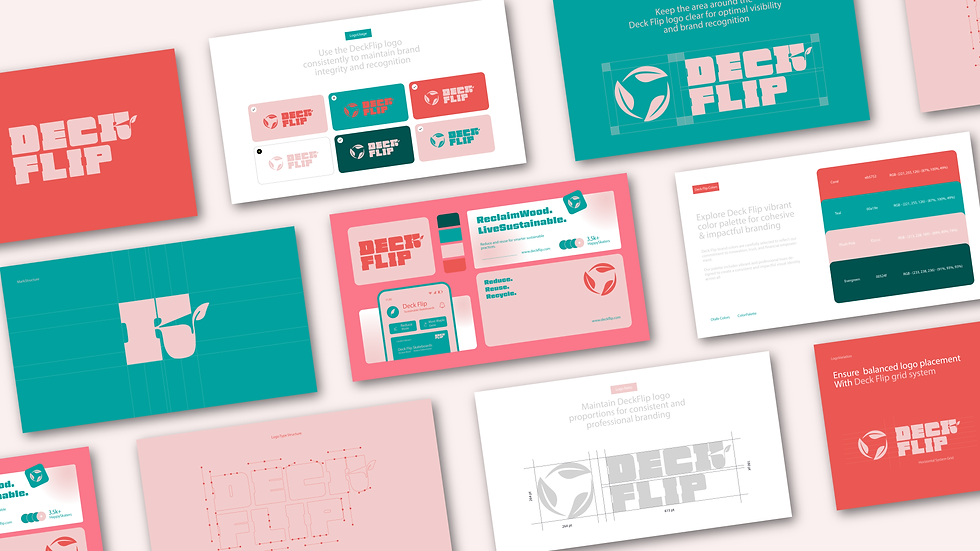
Deck Flip
Conceptual brand exploration for Senior Thesis Project. Deck Flip is a sustainable skateboard brand that repurposes maple wood to reduce waste and deforestation. The design centers around a bold color story and trendy typography to draw in customers to the brand messaging and greater purpose. The subtle leaf motif is incorporated into the letterforms to symbolize the sustainable efforts of the brand.